
Dark mode has become an increasingly popular and expected feature in mobile app development solutions over the last few years. Integrating a dark theme can significantly improve the visual appeal of an app, while also promoting better accessibility and battery life.
In this comprehensive guide, we’ll cover everything you need to know to implement dynamic dark mode toggling in a Flutter app development solution, including:
- The growing popularity and benefits of dark mode
- How Flutter’s powerful theming system works
- Step-by-step implementation instructions
- Customizations for a polished dark mode experience
- Key takeaways and best practices
By the end, you’ll have an in-depth understanding of how to add one of today’s most on-trend features to your own Flutter mobile development solution.
Let’s get started!
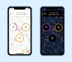
The Rising Prominence of Dark Mode
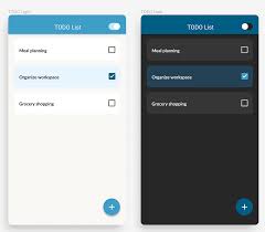
Dark mode refers to a darker color theme where the background uses black or darker colors rather than white or light colors. Text and other interface elements use bright colors that stand out against the dark background.
The concept of dark mode originated many years ago for desktop operating systems and individual apps. But it rose to widespread popularity on mobile over the last few years thanks to Apple and Google.
Apple introduced system-wide dark mode support in iOS 13, allowing users to enable it globally rather than on a per-app basis. This was a major shift that prompted many apps to add dark themes. Google then followed suit by adding a dark theme toggle in Android 10.
With dark mode now easily accessible at the system level, users have widely embraced it. Today, having a dark option is seen as a standard feature that apps are expected to offer.
Implementing dark mode makes apps feel more modern, while showing users that their preferences are being considered. It has become a must-have capability for mobile apps to remain competitive.
Why Add a Dark Theme to Your Flutter App?
What exactly are the benefits of taking the time to integrate dark mode?
- Lower Battery Usage
One of the biggest advantages of using a dark theme is improved battery life, especially on phones with OLED displays. Pixels displaying black or darker colors require significantly less power than lighter pixels.
- Reduced Eye Strain
Staring at bright screens for long periods can cause eye fatigue and headaches. The lower brightness levels of dark mode put less strain on the eyes during extended use.
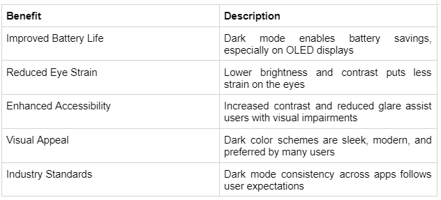
- Enhanced Accessibility
Dark interfaces can increase accessibility for some users. They reduce glare and make screens easier to view in low-light conditions. Dark themes also increase the contrast between text and backgrounds, which improves readability.
Users with visual impairments, light sensitivity, or other conditions may find dark mode easier on the eyes. Implementing it makes apps more inclusive and user-friendly.
- Visual Appeal
Beyond the technical and accessibility benefits, dark themes also look sleek and modern. Dark mode has become a popular aesthetic choice among tech enthusiasts and early adopters.
With all of these benefits, adding dark mode toggle functionality should be a high priority for most apps. Fortunately, the Flutter mobile development solution’s robust theming system makes implementation smooth and straightforward.
Flutter’s Powerful Theming Capabilities
Flutter app development solutions include highly customizable theming support through the Material Design framework. This allows quickly changing visual styles and colors across an entire app with just a few lines of code.
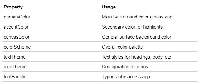
Theming is primarily accomplished using the ThemeData class in Flutter mobile development. This class stores the complete set of colors, text styles, and visual properties needed to define a theme.
Step-by-Step Guide to Building a Dark Mode Toggle
Thanks to Flutter app developers and their robust theming system, implementing a basic dark mode toggle only takes a few steps.
Let’s walk through them in detail:
- Step 1 - Define ThemeData for Light and Dark Modes
The first step is to create separate ThemeData objects that define the appearance of the light and dark themes.
Inside ThemeData, you can customize colors, text styles, icon themes, and various other visual properties to your desired styling.
For example, in a light theme, flutter app developers may want a white background with black text and blue accents. While the dark theme could be a black background with white text and green accents.
Be sure to set the ThemeData brightness property appropriately for each one –
Brightness. light and Brightness. dark.
You now have two distinct themes defined that the app can switch between.
- Step 2 - Manage the App's Active Theme State
Next, you need to track the app’s current active theme, so you know which one to display.
A common way is using a StatefulWidget that maintains the active theme in its state. Initialize the state to your default theme, likely the light theme.
You can then build a method to toggle the state between light and dark when called. This serves as your theme-switching logic.
- Step 3 - Pass the Active Theme to the MaterialApp
With the state defined, pass it to MaterialApp using the theme property. This is where the state gets connected to the UI.

Now, when the state’s active theme changes, MaterialApp will redraw the entire flutter app development solution with the newly updated theme.
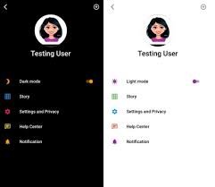
- Step 4 - Add a Toggle to Switch Themes
Finally, it allows users to change themes with a toggle button or switch.
The toggle should call your state-changing method from Step 2. This will switch the active theme and rebuild the UI.
That covers the key implementation steps at a high level! With just those foundations in place, you will have a basic but functional dark mode toggle.
Next, let’s look at some best practices for enhancing the experience.
- Evolving Beyond the Basics
While the above achieves a simple toggle, you likely will want to refine the implementation to polish the dark mode user experience:
- Animated Transitions
The app should cross fade or slide animate between themes for a modern, seamless effect rather than instantly swapping.
- Follow Platform Theme
Respect the system-level light or dark theme set by the user on their device for consistency.
- Separate Color Schemes
Use distinct colors for dark and light modes tailored to each aesthetic rather than just inverting.
- Adaptive Icon Colors
Automatically adjust icon colors to maintain sufficient contrast with the varying backgrounds.
With refinements like these, you can craft a polished dark mode experience that delights users.
Challenges of Dark Mode Implementation
While implementing dark mode offers many benefits, designers and futter app developers face considerable challenges to building a robust and accessible dark theme.
- Maintaining Usability
While the visual appeal of dark mode is undeniable, designers must take care not to overly prioritize aesthetics at the expense of usability. Implementing dark mode requires more than just inverting colors—it demands reevaluating the entire interface and experience.
When transitioning a light theme to dark, designers should be alert for potential usability issues such as:
- Text with previously high contrast becoming harder to decipher against the new dark background. Body text may need larger sizes or heavier fonts to compensate.
- Icons losing meaning without differentiated colors to distinguish them. Adding selective color, backgrounds, or outlines can restore context.
- Subtle visual cues like borders, disabled states, and notifications disappearing into the darkness. These may need brighter colors or selective backgrounds not present in light mode.
Dark mode should not be treated as a solely visual change. Designers must thoroughly test usability in dark mode using methods like:
- Conducting user tests of key workflows to identify areas of friction.
- Checking text readability and button/link visibility at small sizes.
- Validating that icons and UI elements continue conveying their meaning.
- Watching for loss of visual hierarchy, hidden elements, and user deception.
By taking a usability-first approach, designers can catch and resolve issues early before problems impact users. Dark mode can then enhance aesthetics without degrading core usability.
- Adapting Dynamic Content
A significant challenge in implementing dark mode is properly adapting dynamic user-generated content. Text, images, videos, and other media from users often assume a light background color.
Some potential issues include:
- Text with diverse colors blending into dark backgrounds, making it hard to read
- User profile photos appearing dimmer and lower contrast on dark surfaces
- Videos optimized for light mode looking too dark when themes switch
To handle user content, developers have a few options:
- Apply automatic filters to dynamically adjust colors and brightness for dark mode suitability. However, this could reduce quality or fidelity.
- Programmatically detect inappropriate content colors and overlay backgrounds for needed contrast. But this requires extensive technical work.
Adapting UGC for dark mode is an unsolved challenge with no perfect solution yet. Companies like Twitter and Youtube are still iterating and experimenting with possible options.
- Cross-Platform Testing
Once dark mode is implemented, thorough testing is required to ensure it works properly across the full spectrum of target devices and platforms.
Dark mode should be verified on:
- Different iPhone and Android models and OS versions
- Tablets with various screen sizes
- Desktop web browsers like Chrome, Firefox, Safari
- Mobile web browsers on iOS and Android
Testing should validate:
- The theme toggle functions reliably with no crashes
- Animations and transitions perform smoothly
- There are no layout issues on different screen sizes
Testing on the oldest and lowest-powered target devices is especially important to catch performance issues.
Rigorously testing dark mode across the full matrix of devices and platforms is key to providing a seamless user experience. Comprehensive testing protects against obscure platform-specific bugs.
- Accessibility Considerations
While beneficial for some visual impairments, dark mode may be unsuitable for users with astigmatism, dyslexia, migraine disorders, and other accessibility needs.
Sufficient contrast ratios must be maintained, along with providing user customization options like brightness controls. Dark mode is not a one-size-fits-all solution.
- Onboarding Users
Light mode users new to dark mode require proper onboarding on the benefits and how to use it. Instructions should guide users to enable dark mode system-wide if desired. First-time launch experience should be calibrated for potential disorientation.
By preemptively addressing these known challenges, flutter developers can deliver excellent dark mode experiences optimized for usability, accessibility, and delight.
Key Takeaways and Recommendations
Here are some top tips to remember:
- Treat dark mode as a first-class feature with thoughtful design
Provide an easily accessible toggle for switching between light and dark modes. Don't bury it deep in settings.
- Consider offering graduated options between the extremes. For example, allow adjusting system brightness or contrast levels within dark mode.
- Let users customize colors like accent shades and text hues to suit their preferences.
- Offer scheduling based on time of day, such as automatically transitioning to dark mode at sunset.
- For apps with many pages, enable theming on a per-page or per-section basis.
Providing abundant flexibility empowers users to fine-tune dark mode to their needs. Smoothly transitioning between modes maintains consistency. Customization options demonstrate attention to user preferences and accessibility requirements.
By not imposing a rigidly designed singular dark theme, apps enable personalization for the diverse range of users embracing dark mode.
Properly implementing dark mode requires considering many details, but Flutter app development solutions provide all the tools you need to build it right. The effort pays off with happier users and a more polished app.
Conclusion
Dark mode has clearly established itself as an expected and preferred feature in modern mobile apps over the last few years. Implementing a robust dark theme demonstrates attention to detail in design as well as adapting apps to follow emerging industry standards. As we have covered, the Flutter mobile app development solution’s powerful theming engine makes adding dark mode toggle functionality straightforward from a technical perspective. With some thoughtful refinements and customizations, developers can craft an impeccable dark mode experience that delights users.
However, while dark mode offers significant benefits like improved battery life, reduced eye strain, and enhanced accessibility, especially for those with visual impairments, it is not universally embraced by every user either. Flutter app developers should avoid assumptions and design both light and dark interfaces with equal care.
Looking at the future, dark mode will likely continue gaining prominence as a standard feature users want. Some areas for ongoing improvement include providing users with more fine-grained theming controls based on use cases or times of day. Smarter scheduling systems could automatically transition between light and dark modes based on sunrise and sunset. More user studies on the long-term impacts of extensive dark mode usage will provide valuable insights for refinement.
For Flutter developers and companies looking to capitalize on the dark mode trend, partnering with experienced mobile development firms knowledgeable in Flutter can smooth the process. Leading Flutter mobile app development experts like Consagous Technologies stay on the cutting edge of emergent capabilities like dark mode support across platforms.
Our talented flutter app developers can audit existing app UI/UX to determine dark mode demand and viability. We can execute pixel-perfect dark theme redesigns tailored to a brand's style.
By handling the complex state management and animations, our flutter developers enable seamless light/dark toggling that delights users. Our accessibility-focused testing guarantees standards are upheld. We can even extend dark mode across companion apps and websites for unified experiences.
Contact us to know more!
Get Free Consultation
Let our extended team be part of your journey and help you.
